This task focused on preparing the site for enhanced design elements and interactivity based on Figma directions. Key updates were made to the homepage structure, CTAs, navigation, and mobile usability to align with brand goals and improve the customer journey.
The client required several targeted adjustments to the theme layout and navigation, with guidance provided via Figma.
Key objectives included:
Safely working on the theme without affecting the live site
Updating homepage section order and CTA behaviors
Improving mobile usability with cleaner navigation logic
Adding visual cues like sale tags and hover states for better engagement
Solution
We proposed a structured delivery pipeline with clarity at every stage, ensuring the client can review and approve content and layout before moving into development.
NAVIGATION & INTERACTION ENHANCEMENTS
Added a hover effect on the “Shop Now” link in the main navigation
On mobile, replaced arrows with a clear “Shop Now” CTA, linking directly to product detail pages
HOMEPAGE STRUCTURE & CTA CHANGES
Reordered homepage sections according to the Figma layout
Updated all primary CTAs across the homepage:
Replaced “Shop Now” buttons with Add to Cart where applicable
Ensured button interactions matched brand tone and improved funnel flow
VISUAL TAGGING
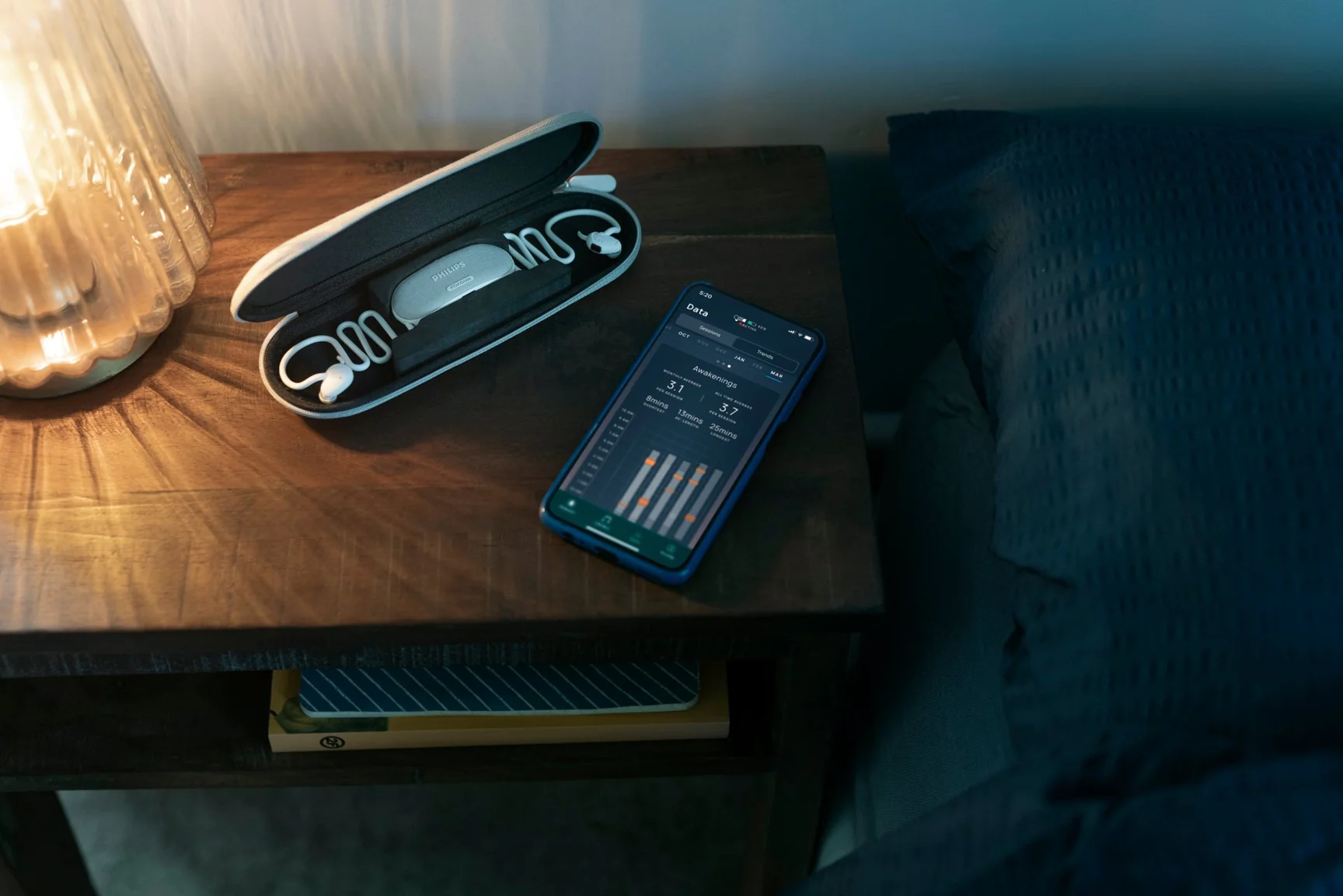
Applied a Sale tag to the “Nightbud” menu item for promotional visibility
Added and styled CTAs within each homepage section to ensure action-oriented design
Final Result
A refined theme with updated homepage flow, enhanced CTAs, and better navigation across desktop and mobile. All changes align with the Figma design and aim to improve usability, engagement, and conversions across key customer touchpoints.